Table of Contents
Item Extension functionality allows adding additional inputs for custom information for Item Posts.
Feature consist of two parts:
- Item Extension settings on admin page Citadela Listing > Item Extension where can be created additional inputs,
- Item Extension block which show on Item Detail pages information from inputs.

Item Extension
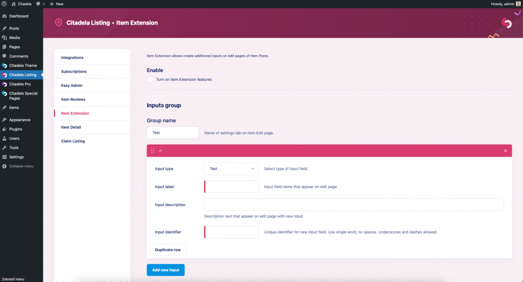
Settings are available in Citadela Listing > Item Extension admin page. Available are settings:
- Enable – turn on Item Extension functionality. If disabled, created inputs are not available on edit screen of Item posts and Item Extension block doesn’t show any information on the frontend.
- Group name – custom label of tab with new inputs on Item Edit page.
Inputs can be reordered using drag & drop to show inputs in wanted order. In the same order are displayed also information on the frontend.
Available options for each new input:
- Input type – selection of available input types
- Input label – label text displayed with input on Item edit screen and also displayed with inserted value on the frontend of Item Post
- Input description – help text displayed on Item edit screen with input, should include description of value expected in the input
- Input identifier – unique identifier that is used to recognize input, data are saved under this key in database as post meta for each Item Post with prefix “_citadela_item_extension_”
Available input types:
- Text
- Textarea
- Url
- Number
- Date
- Checkbox
- Select
Some of the inputs allow you to fill more information with created input. Find detailed information below.
Checkbox input
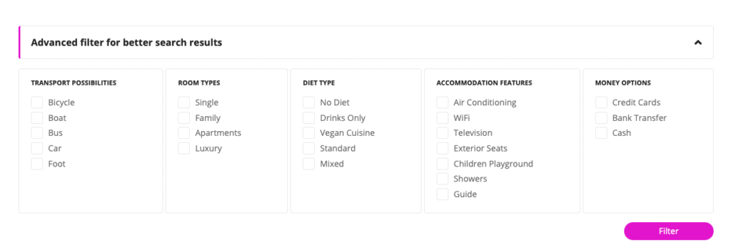
Checkbox inputs may be grouped into several different groups using text in “Filters group name” input. This functionality is related to the Advanced Filters feature which allows you to show a group of checkboxes to filter Item posts search results. More information can be found on documentation pages related to Advanced Filters.
Simply use the same name of the group for checkboxes that would be displayed in filter groups together.
Select input
With select input, you should define which values will be available in selection on the Item edit screen.
Each option is inserted in one line of Choices input in value_identifier : Value text.
For example, to use a selection of colors like Red, Blue, and Green, should be inserted:
red : Red
blue : Blue
green : Green
Default selection text input is available to insert custom text for the first empty option is created selection. It’s default value until isn’t selected option on the Item edit screen.
URL input
With URL input can be on Item edit screen displayed also additional input for text which is displayed instead of full URL on the frontend.
n order to show this input on the Item Edit page with URL input, just select the option Show link label input in settings of your URL input.
If this text isn’t filled for the Item post, the full URL inserted in the URL input is displayed on the frontend.
Number input
With a simple number, value can be displayed also a unit of value.
In settings of number input simply insert your unit text in the Unit field and this text will be displayed with number value on the Item detail page.
Position of the unit can be defined via selection Unit position to show unit on the left or right side of number value.
For example, if your number input would store price value, you can fill the Unit field with text $ and defined Unit position to value left.
Now for example value 500 inserted in the Item edit page in this number input will be displayed on the frontend like $ 500.
Search results filter
Results can be filtered by item extension fields:

